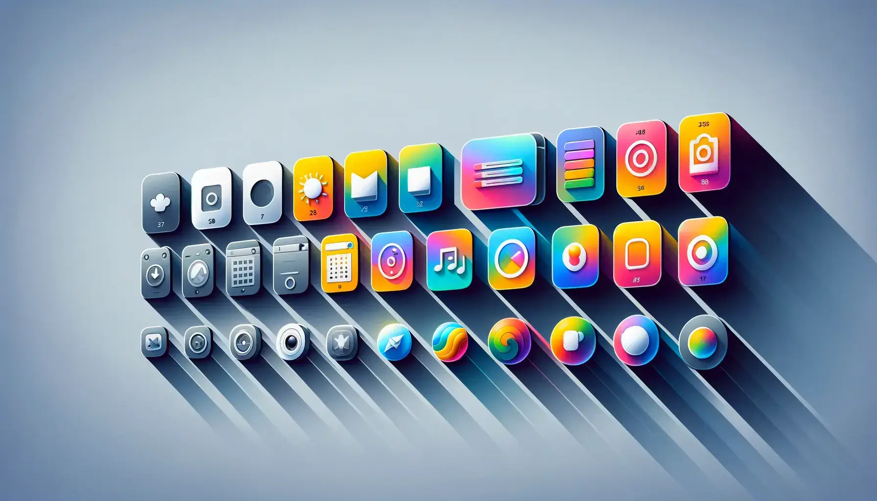
Key Takeaways:
- Icon packs enhance user experience by providing visual consistency and clarity.
- Recent trends show a resurgence of skeuomorphic and 3D icon designs.
- AI-generated icon packs are becoming increasingly popular for personalized interfaces.
In the fast-evolving landscape of digital design, icon packs have become foundational resources for crafting visually harmonious and intuitive user interfaces. By providing a carefully designed collection of icons, these packs help designers deliver seamless visual narratives that enhance usability and brand identity. The emergence of sophisticated tools such as an icon maker has made it easier for professionals and enthusiasts alike to access and customize icon sets that fit their unique project needs.
Icon packs are more than just decorative assets. They serve a critical function in guiding users through interfaces, aiding recognition, and bridging the gap between design and function. Whether in mobile applications, web platforms, or desktop environments, the right iconography is key to clearly communicating each feature’s purpose.
As digital experiences evolve, so does the expectation for visually engaging and functional iconography. Users increasingly demand that interfaces not only look appealing but also operate with clarity, thanks to coherent and uniform icon design. The shift toward this attention to detail has pushed icon packs to the forefront of user experience strategy.
With the advent of new trends and technologies, designers are continually rethinking traditional approaches to icon design to achieve greater user satisfaction and engagement.
Enhancing User Experience Through Visual Consistency
Visual consistency is one of the hallmarks of a great digital product. When users encounter a set of icons that utilizes a consistent style, color palette, and visual weight, they are more likely to intuit the meaning and function of interface elements. This reduction in cognitive overload streamlines workflow, minimizes mistakes, and fosters loyalty through positive first impressions. A uniform icon set contributes not only to navigation ease but also to a design’s professionalism and reliability.
The Resurgence of Skeuomorphic and 3D Icons
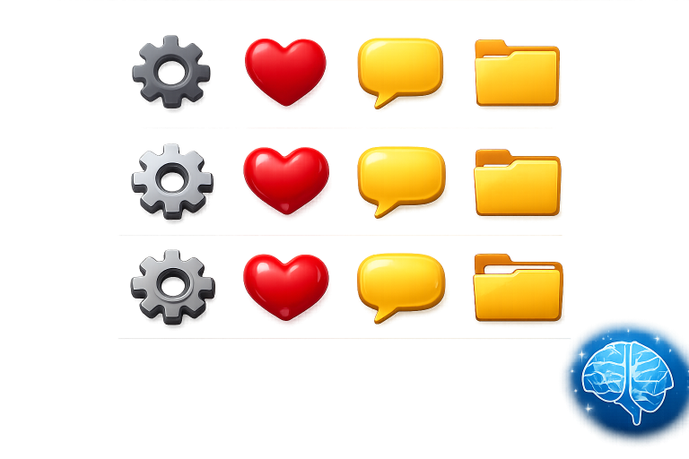
Icon design trends have shifted notably in recent years, with a strong resurgence of skeuomorphic and 3D effects after a long period dominated by minimalistic, flat designs. This return to detail and realism is more than an aesthetic preference; it offers increased engagement and emotional resonance by mimicking familiar real-world objects. Companies such as Apple and Airbnb have spearheaded this shift by embracing more tactile, multi-dimensional icons in their user interfaces, signaling the return of design elements that call back to users’ physical experiences. For a comprehensive exploration of how tech giants are driving this trend, review this analysis by Bloomberg.
AI-Generated Icon Packs: A New Frontier
Artificial intelligence has introduced powerful tools for personalizing and optimizing icon packs. Instead of relying solely on static sets, designers now harness AI to generate dynamic and unique icons tailored to user preference or brand guidelines. For instance, Google’s Pixel Launcher supports AI-generated icons that can adapt their appearance to fit users’ themes and accessibility needs. This approach not only saves time but also brings a new level of customization and scalability to digital products.
Benefits of Using Icon Packs
- Time Efficiency: Designers gain speed by utilizing ready-made icons rather than crafting each one from scratch. This efficiency is crucial in fast-paced development cycles.
- Visual Harmony: Icon packs offer a cohesive set that maintains visual and thematic unity across products, enhancing overall brand presentation.
- Scalability: Professionally designed icon sets retain sharpness and clarity at all sizes and resolutions, ensuring quality across devices.
Challenges and Considerations
Despite their benefits, icon packs can present challenges if not used thoughtfully. Overusing generic sets can sap originality from a product, resulting in an indistinct look that fails to capture the user’s attention. In addition, icons must be chosen for relevance, clearly representing their associated functions to reduce user confusion. Some icon sets may require customization to align with a brand’s specific style or messaging.
- Overuse: Relying too heavily on standard icon packs risks creating a bland or derivative interface.
- Relevance: Icons must be intuitively mapped to their functions to ensure optimal usability.
- Customization: Adjusting iconography to reflect a brand’s identity can enhance uniqueness and user trust.
Best Practices for Implementing Icon Packs
- Choose the Right Style: Select icon packs that support your interface’s overall design language, whether minimalist, skeuomorphic, or somewhere in between.
- Maintain Consistency: Apply the chosen icon set uniformly across your application to reinforce visual logic.
- Test for Usability: Conduct thorough user testing to validate that icons convey the intended meaning and facilitate smooth navigation. For further reading on usability standards, visit NNG Group.
Conclusion
Icon packs are instrumental in crafting user-friendly, visually consistent, and engaging digital interfaces. As trends shift toward more expressive forms of iconography and technologies such as AI expand the creative toolbox, designers are empowered to push the boundaries of user interface design. By selecting, customizing, and implementing icon packs with care, teams can deliver products that not only function intuitively but also delight users through thoughtful visual design.